A review of 2012, with a look forward to what 2013 has in store
Fullscreen images
Fullscreen images have really come into focus in the past year or so. This is because the public in general now have faster internet connections. This, combined with more easily accessible Content Delivery Networks (CDNs) makes serving large images easier.

Editorial approach
Conversely, Four Seasons, one of the big relaunch stories of 2012, moved away from large images. They switched to a more editorial style, with a magazine-like look and feel. This made a big impact — although the biggest impact was the news that it had cost USD18 million to remake (including photography!). The hidden truth for this was that conversions dropped dramatically after the redesign.

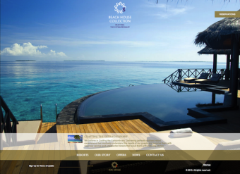
Widescreen
Also going for a richer interface, although in a more radical design, was Sofitel.com. This is a site that makes full use of the new reality of web design, widescreen monitors that are on all new laptops.

Mobile
Mobile really came of age in 2012, with most companies having sites that at least work on mobile, and many taking the opportunity to have dedicated sites for smartphones. Not many followed MacDonald hotels’ 2011 lead of a ‘responsive’ design — a single site that changes size and shape when viewed on different browsers (phone, iPad, computer). A great idea, but not without branding and technical challenges.

R.I.P. Flash
Flash finally died in 2012, with everyone realising the importance of making things work on iPads.
Scrolling is acceptable!
Scrolling was finally accepted as normal user behaviour, mainly because of iPads and very wide but shallow laptop screens. This saw sites that embraced very long pages, often with jumps or the parallax effect.

Social Media ubiquitous
Social media became a standard on sites, and Trip Advisor finally became accepted, and more, embraced, with many websites embedding widgets and badges.

2013 brings…
Responsive design?
Will 2013 finally be the year of responsive design? We’re already starting to see RFPs asking for it, although it is not always the right decision for strongly branded hotels and groups. Key CMS providers, and indeed QUO itself, whilst open to responsive, generally recommend an ‘adaptive’ approach, reusing core content and functionality from the main CMS, tailored to specific contexts.
Flat design
If you’ve used the Gmail or Google Maps app on the iPhone, you’ll have seen examples of Flat Design. A complete departure from heavily textured designs, this approach gets back to basics to create a deliberately uncluttered view. Surely some hotels will adopt this style during this year.

It’s great to see that in 2013, there’s still lots happening in the world of web design, and many new things that hoteliers and marketers can take advantage of.
This article was first published on the QUO site.
Anthony Green — February 2013
 Email me
 Linkedin
 Follow Me
 a.nthonygreen