 Web designers and marketers have a right to feel cheated — no sooner had they started building websites to match the shiny new big monitors that people were getting with their desktops, than the whole landscape changed. Instead of large, square monitors, the market shifted, and in came widescreen monitors. The shape matched the HD TVs that everyone has been buying like crazy, and the fact is that TVs and movies look great!
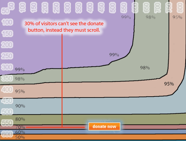
This created a problem: nearly all laptops, and now most desktops, come with screens that are much wider, but offer only 600, 768, or 800 pixels in height. If that doesn’t mean much to you, previously the most common size was much bigger, 1024 high — so much more space — whereas now the fold is really high up the page.
Web designers were among the last to notice, with their large monitors. Business users noticed, with their ultra-small laptops, and many design teams were caught out.
What does this mean for hotels building websites?
A different set of rules needs to be considered. Big images, which we’d grown to love after years of bandwidth imposed starvation, need to be used carefully, so that content isn’t pushed below the fold (the part of the website that can be seen when the page loads, without scrolling).
Creating a great look and feel, for luxury products in particular, can be difficult in an industry now hooked on large images.
Don’t get me wrong, i still believe in longer web pages, and have confidence in the evidence that people do scroll, but key proposition, brand message, and call to action should all be above the fold.
How do i test?
Google, as always, is well prepared, and as always, wants to share. Go to browsersize.googlelabs.com and put your URL in the box to see what percentage of users can see key items on your site. The image below shows the Google tool, and shows a sample website with a Donate button — the problem being that only 70% of users can see it, and therefore 30% of users won’t transact on this site. You’ll notice that width isn’t a problem, it’s all in the height.
Careful design will make the most of these constraints, so keep pushing your development team to find the right solution for your website.
Seen any good examples of sites that are optimised for our new design reality? Please share them!
Anthony Green – September 2010
You May Be Interested In…
Top 10 Mistakes to Avoid on your Hotel Website
Who are booking hotels online, technically speaking?

 Download as PDF
[…] Anthony Green: Widescreen Websites — the New Design Reality […]